CARTER’S • ESG REPORT, PLACEMENT & MICROSITE
Carter’s
No brand standards, no old look to lean on. The color palette and icons I created became part of Carter's branding.
80+
Pages redesigned from scratch, with none of last year's look carried forward
30+
Custom icons, built for reuse across the brand
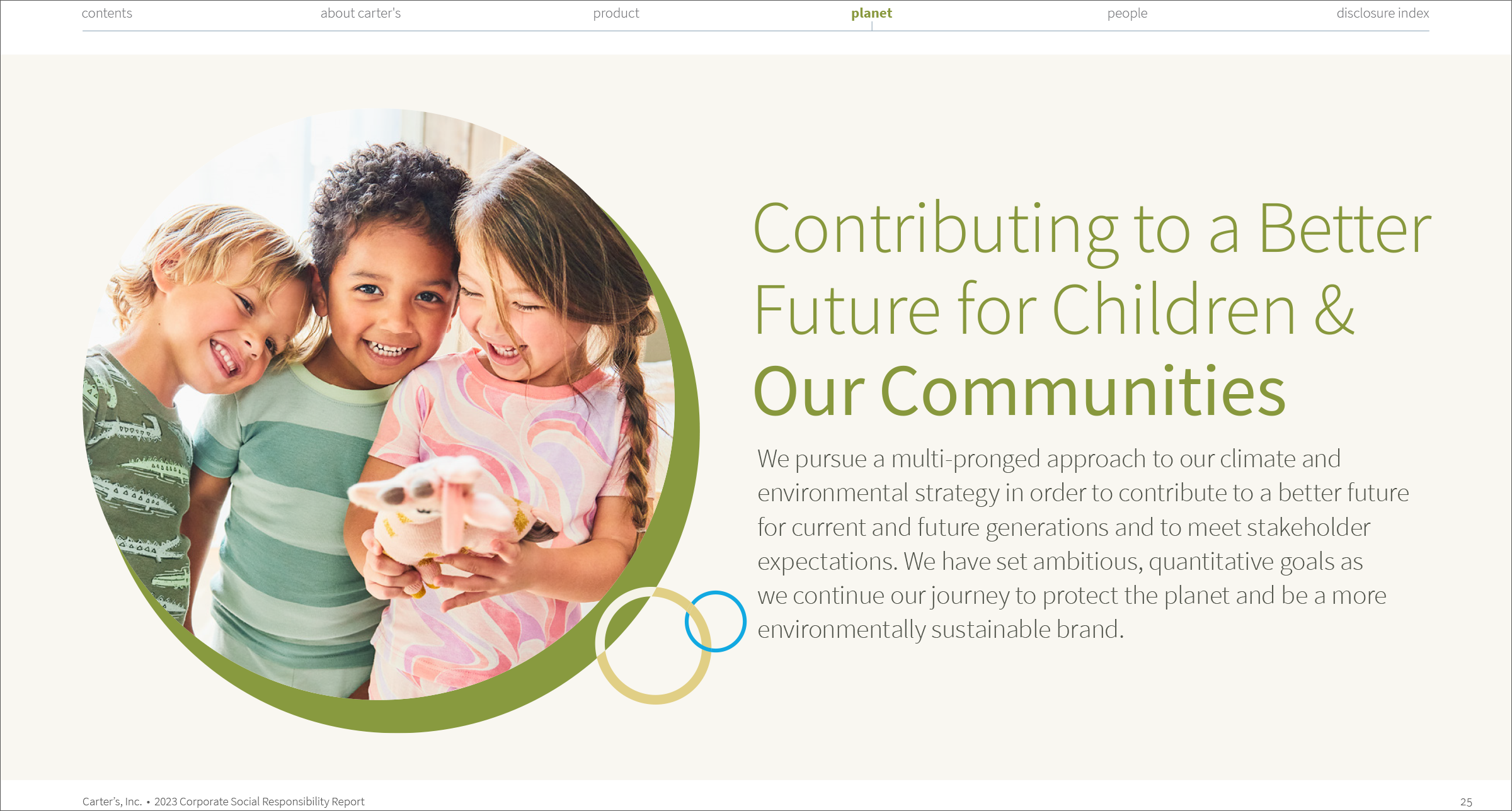
Before & after
Less chart, more child — the story leads, the data supports it.
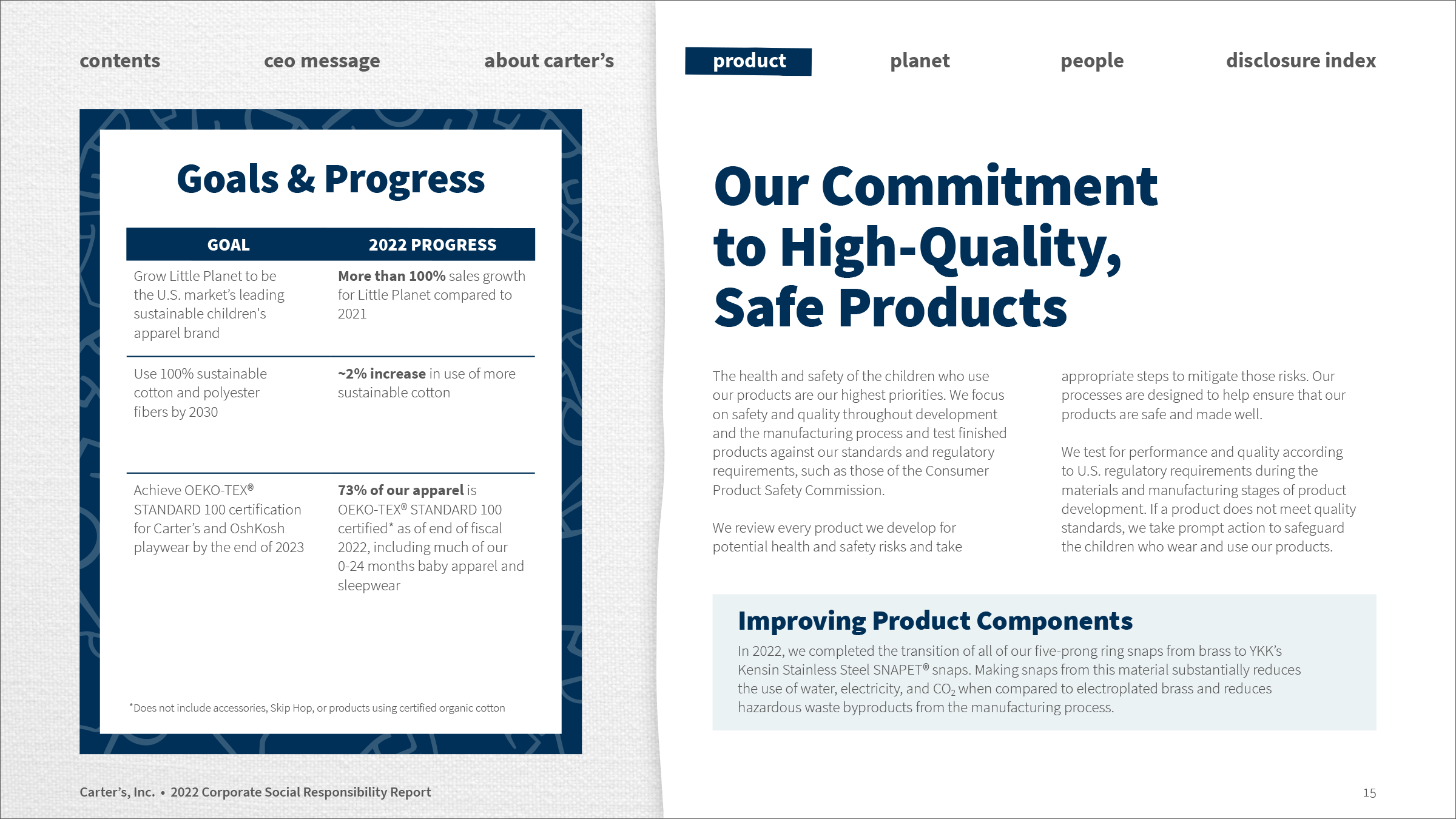
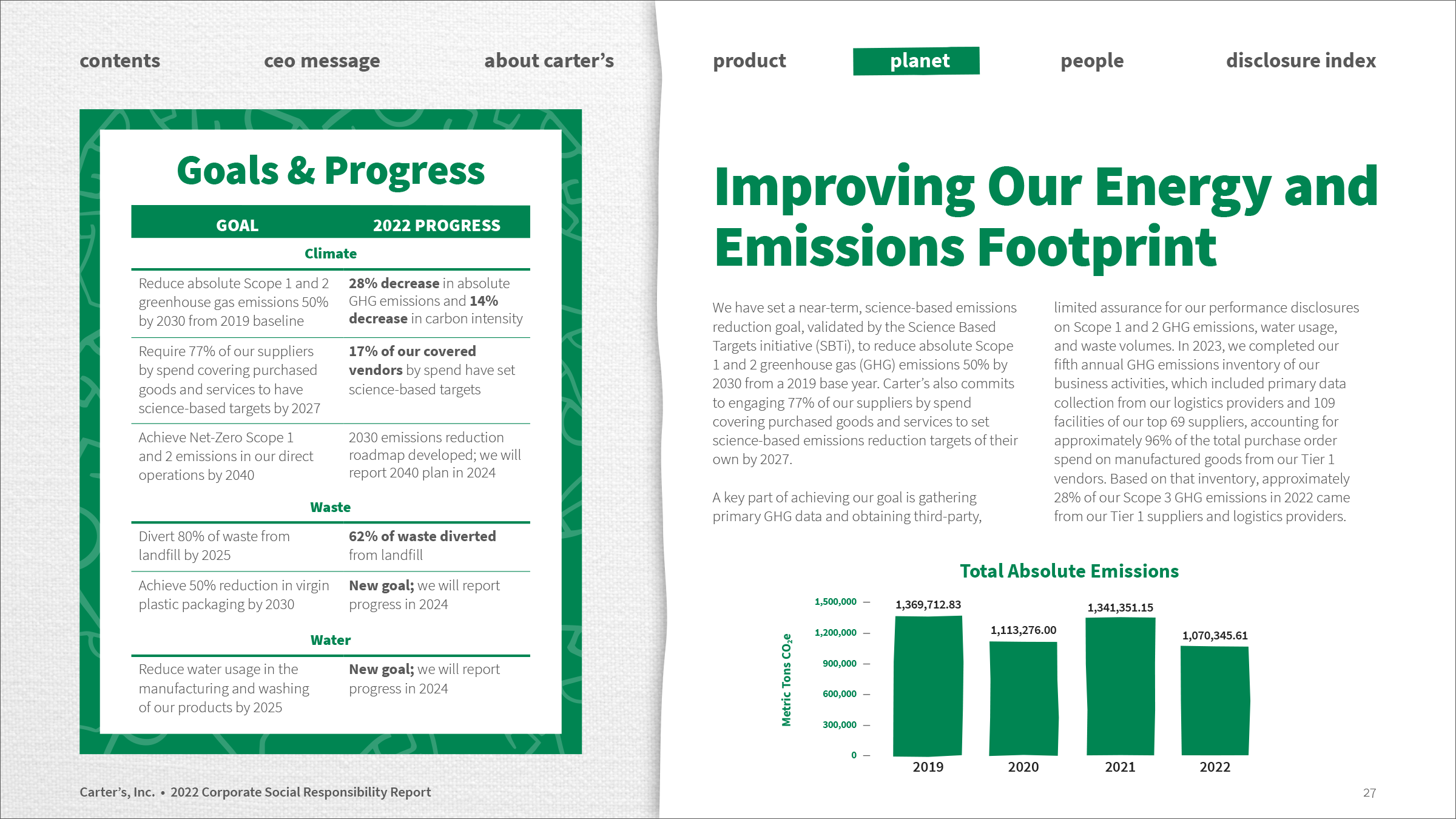
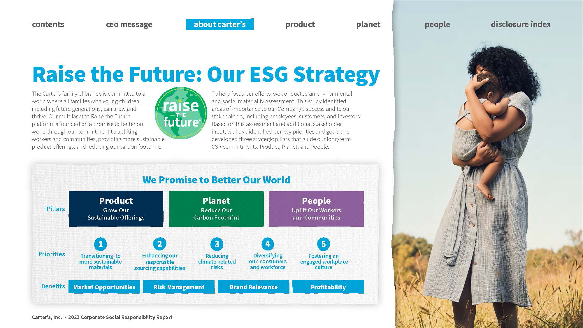
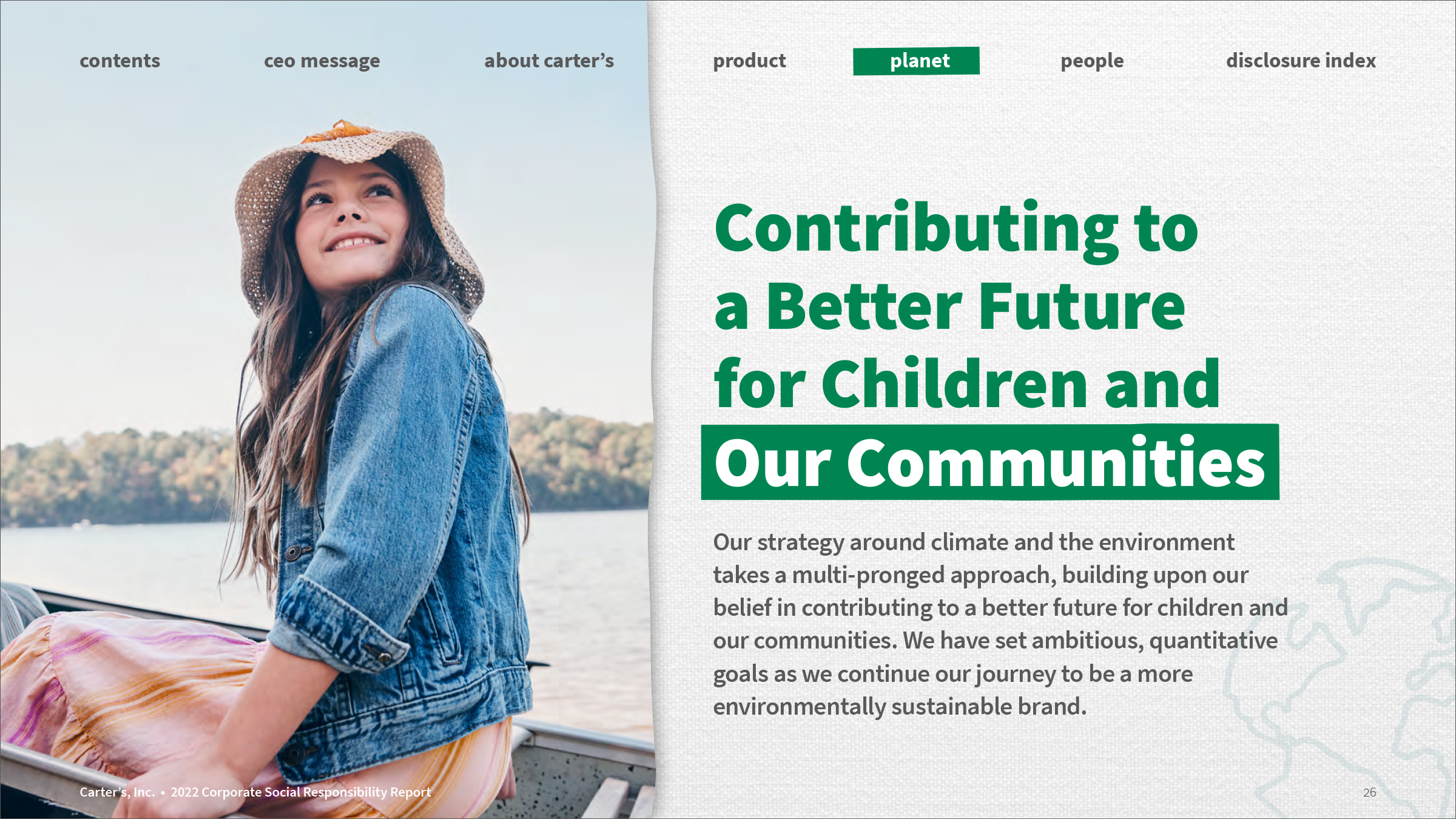
The ask
A global sustainability deck packed with dense text across multiple modules—inconsistent, hard to scan, and lacking the polish the brand needed.
Formats: the full ESG book, a companion placemat, and a microsite
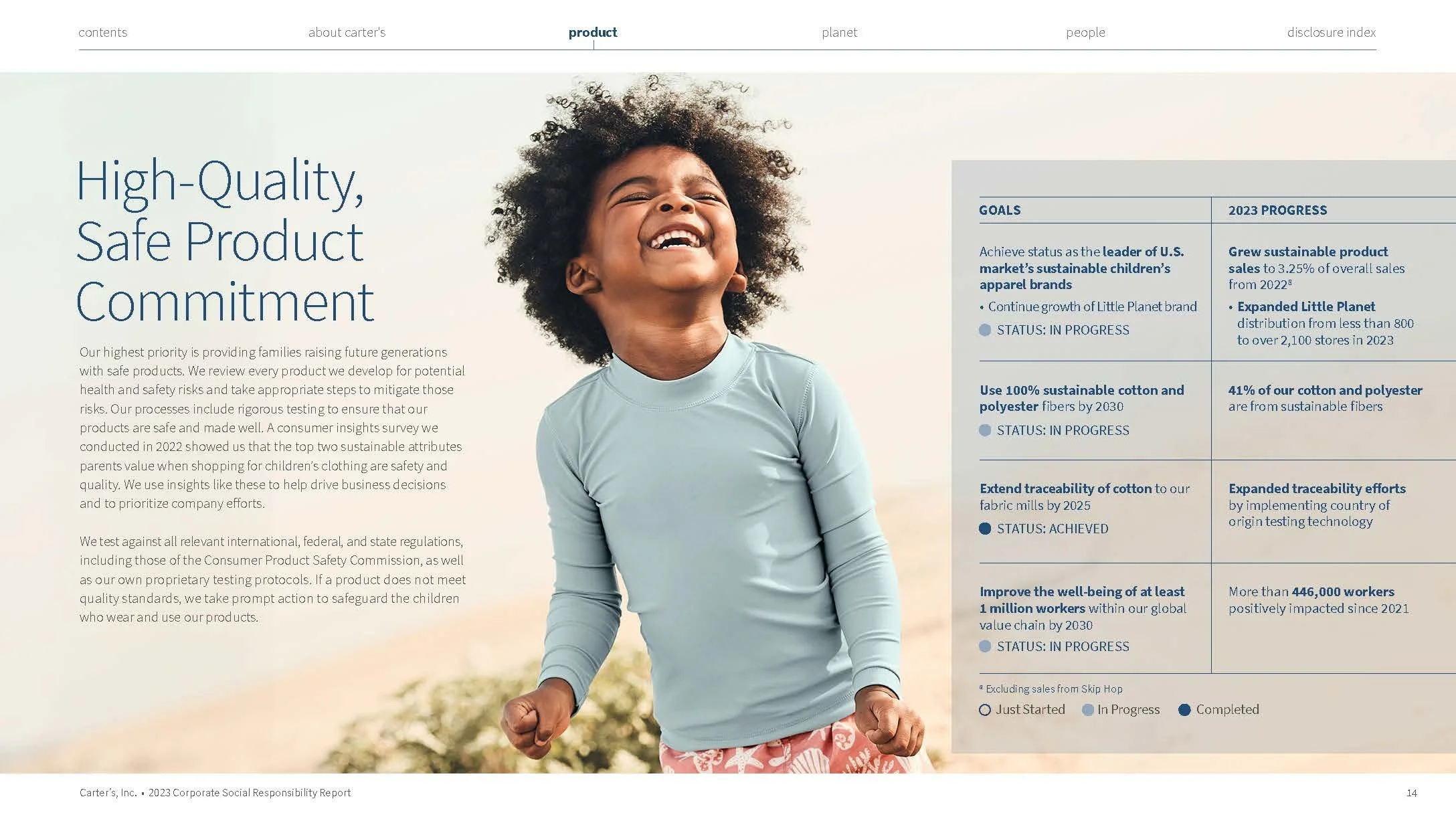
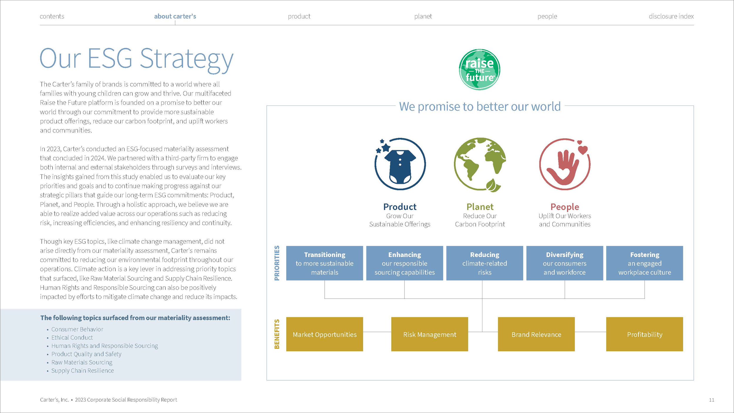
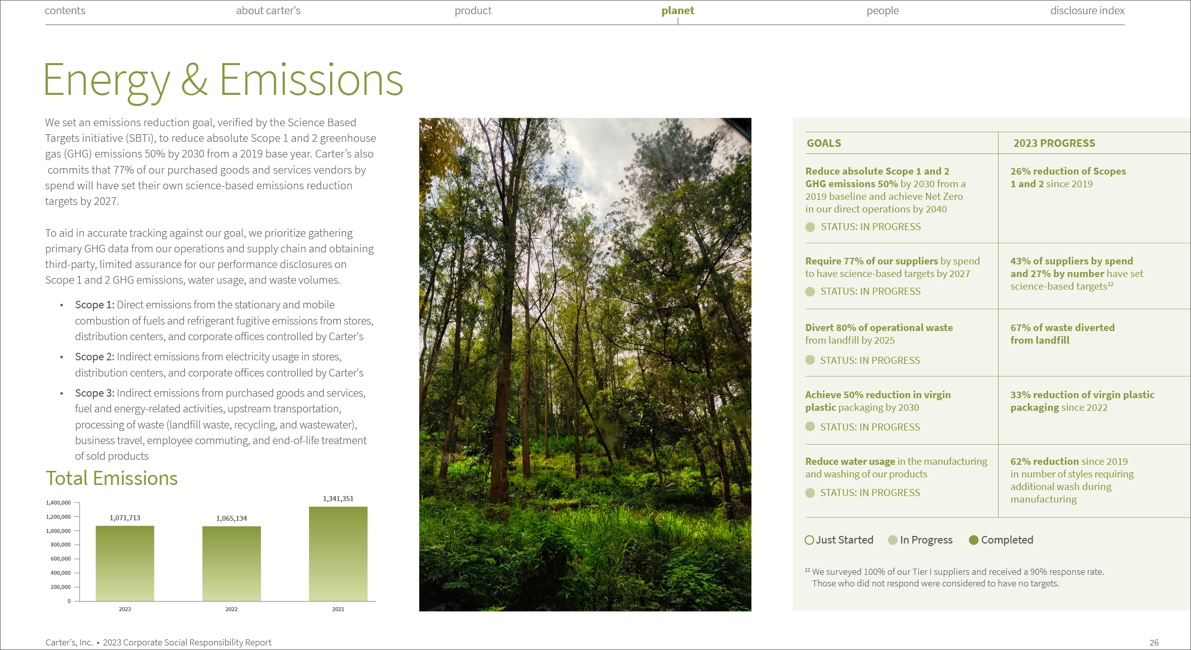
What I did
Built a presentation system with type hierarchy, grid, color, and icons, letting human-centered imagery carry the story and turning dense charts into quick reads.
3
The result
Faster comprehension for frontline teams and a reusable template for every module that follows. Carter signed a 5-year agreement to stay with the agency because they loved the design work.
Need a report people will actually read?
Impact reports, training modules and reusable presentation systems.
NEXT PROJECT